Using the Advanced Chart Formatting commands, you can easily transform your chart into a visually striking, branded, and dynamic image.
For a walkthrough of opening and using the Advanced Chart Formatting window in the Ad Hoc Editor, as well as an extensive list of accepted formatting commands, see the Advanced Chart Formatting article.
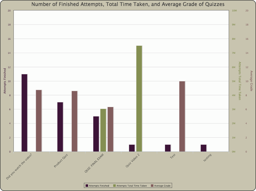
This chart is the direct result of the steps in the Multi-Axis Chart case study.
To transform this chart into the chart pictured above, follow steps 1-5 in the Advanced Chart Formatting article, then enter the following formatting commands and values:
| Property | Value |
|---|---|
| title.text | Number of Finished Attempts, Total Time Taken, and Average Grade of Quizzes |
| title.style.fontSize | 24 |
| chart.borderWidth | 2 |
| chart.borderColor | #141619 |
| chart.borderRadius | 20 |
| chart.spacingTop | 20 |
| chart.marginTop | 50 |
| chart.plotBorderWidth | 1 |
| chart.plotBorderColor | #141619 |
| xAxis.labels.style.color | #141619 |
| xAxis.labels.style.fontSize | 14 |
| yAxis.title.style.fontSize | 14 |
| legend.borderColor | #141619 |
| legend.itemStyle.color | #141619 |
| tooltip.valueDecimals | significant |
| tooltip.borderRadius | 10 |
| colors | ["#351431", "#798448", "#775253"] |
| chart.backgroundColor | #c1bca6 |
| chart.plotBackgroundColor | #FCFCFB |