For the purposes of this case study, we will create a Multi-Axis Chart using the Quiz Domain.
To create a Multi-Axis Chart in the Ad Hoc Editor, complete the following steps:
- From the Home page, select Create > Ad Hoc View from the main menu bar. The Select Data wizard appears.
- In the Select Data wizard, select the Quiz Domain.
- Click Choose Data. The Choose Data page opens.
- In the column between the Source and Selected Fields panels, click the Select All button
 to select all data from the Quiz Domain for availability in your Ad Hoc View. The Course, User, and Quiz sets will move from the Source to Selected Fields panel.
 - Click the OK button. The Ad Hoc Editor opens.
- In the Ad Hoc Editor top navigation, select Chart from the View Type list:
- Click the Chart Detail Selector icon
 and select Chart Types. The Select Chart Type dialog appears:
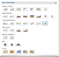
- In the Dual and Multi-Axis section, select the Multi-Axis Column chart type (outlined in blue in the previous image).
- Close the Select Chart Type dialog.
- To successfully create a Spider Area Chart, you will need at least three measures and a single field.
For the purposes of this case study, drag the following Quiz Domain items from the Fields and Measures panels into the Columns and Rows boxes, respectively:- Attempts Finished: From the Quiz Statistics set (within the Quiz set) in the Measures panel. Drag this measure into the Columns box. This will display the number of finished quiz attempts.
- Attempts Total Time Taken: From the Quiz Statistics set (within the Quiz set) in the Measures panel. Drag this measure into the Columns box. This will display total time taken to complete a quiz.
- Average Grade: From the Quiz Statistics set (within the Quiz set) in the Measures panel. Drag this measure into the Columns box. This will display the average grade of quiz attempts.
- Quiz Name: From the Quiz set in the Fields panel. Drag this field into the Rows box. This will associate each quiz attempt statistic with the corresponding quiz.
Once these three measures and this single field are added, you will see the initial stages of your Multi-Axis chart: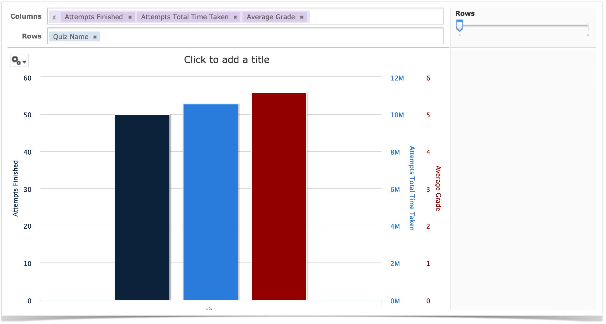
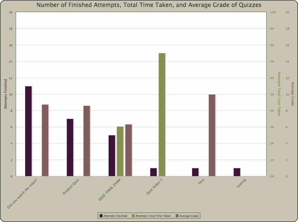
- In the Filters panel (pictured in the right-side of the previous image), drag the Rows slider all the way to the right, enabling a row for each quiz,
You will now see a completed basic Multi-Axis Chart of your number of finished quiz attempts, total time taken, and average grade of quizzes. Note the color-coded additional axes: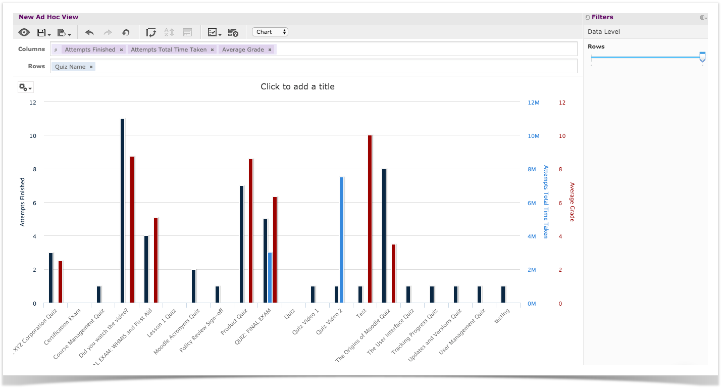
For specific formatting commands to replicate the appearance of the chart pictured at the beginning of this case study, see the Multi-Axis Chart Formatting article.