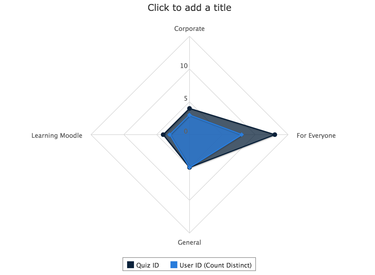
Before
(Standard Formatting)
After
(Custom Formatting)
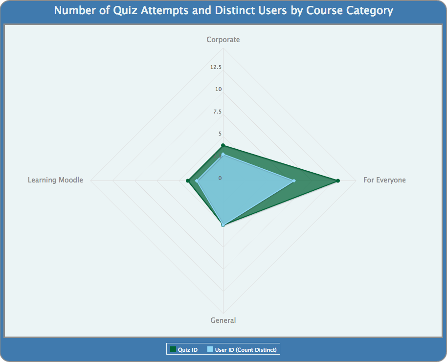
Using the Advanced Chart Formatting commands, you can easily transform your chart into a visually striking, branded, and dynamic image.
For a walkthrough of opening and using the Advanced Chart Formatting window in the Ad Hoc Editor, as well as an extensive list of accepted formatting commands, see the Advanced Chart Formatting article.
The Before chart (pictured above) is the direct result of the steps in the Spider Area Chart case study.
To transform this chart into the After chart (pictured above), follow steps 1-5 in the Advanced Chart Formatting article, then enter the following formatting commands and values:
| Property | Value |
|---|---|
| chart.borderWidth | 2 |
| chart.borderColor | grey |
| chart.spacingTop | 20 |
| chart.marginTop | 50 |
| chart.plotBorderWidth | 3 |
| chart.plotBorderColor | grey |
| xAxis.labels.style.color | grey |
| xAxis.labels.style.fontSize | 14 |
| legend.borderColor | #E8F2F4 |
| tooltip.valueDecimals | 0 |
| tooltip.borderRadius | 10 |
| colors | ["#005A31", "#84D2F6"] |
| chart.backgroundColor | #386FA4 |
| chart.plotBackgroundColor | #E8F2F4 |
| title.text | Number of Quiz Attempts and Distinct Users by Course Category |
| title.style.fontSize | 22 |
| title.style.color | #E8F2F4 |
| legend.itemStyle.color | "white" |
To rotate the axis labels to match the example charts, complete the following steps:
- Click the Chart Detail Selector icon
 to open the Chart Format window.
 - In the Rotation of X-Axis Labels field under the X-Axis heading, change the value from "-45" to "0" and click Apply. This rotates the label text to the most legible position.