This case study walks you through a workaround to ensure that Pie Charts fill the entire allowable space within the canvas.
The size of a single full Pie Chart in Zoola™ correlates to the height and width of your browser screen. Generally, this creates a well-sized Pie Chart suited for standard Reports. However, certain extreme ratios of browser window width/height can drastically alter the size of the Pie Chart. If, for example, you are creating a Dashboard in which the Dashlets are stretched wide or thin, the diameter of your Pie Chart will be fairly small—as shown in the following table:
Scenario | Result |
|---|---|
| Browser Width and Height are the same | 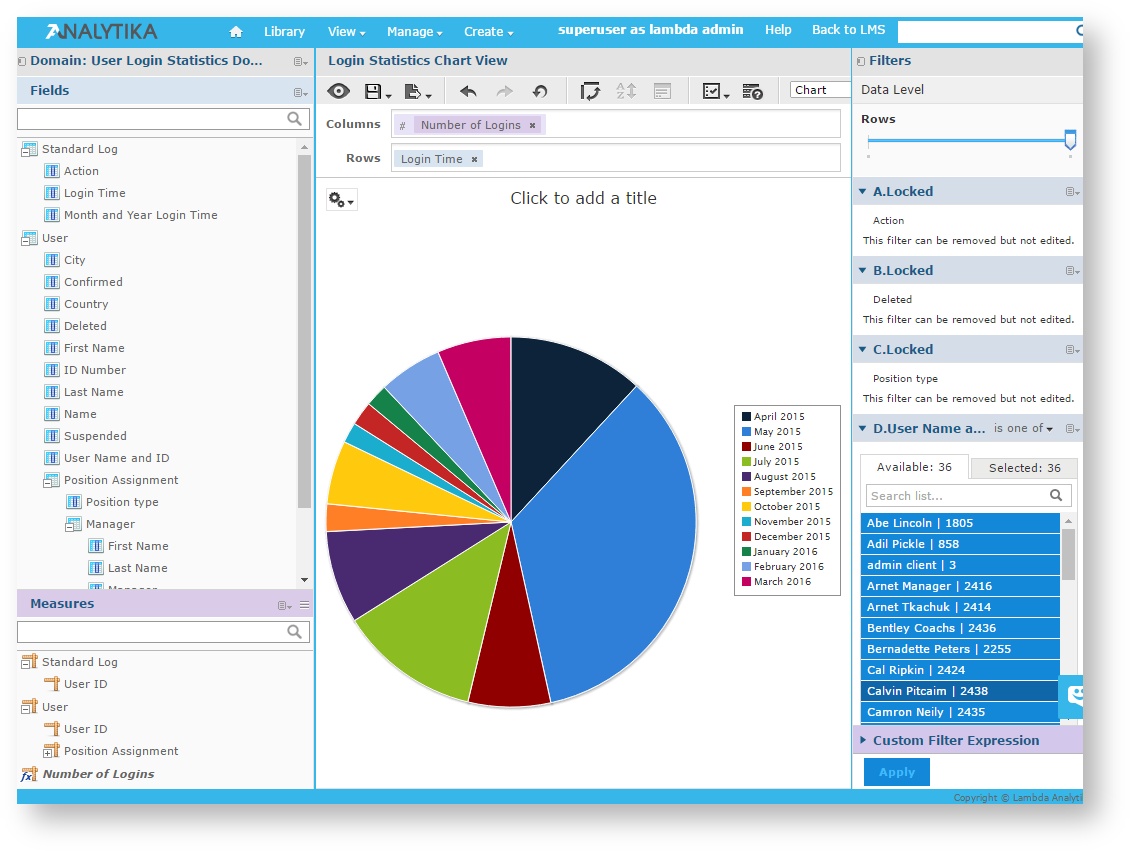 |
| Browser Width somewhat greater than Height | 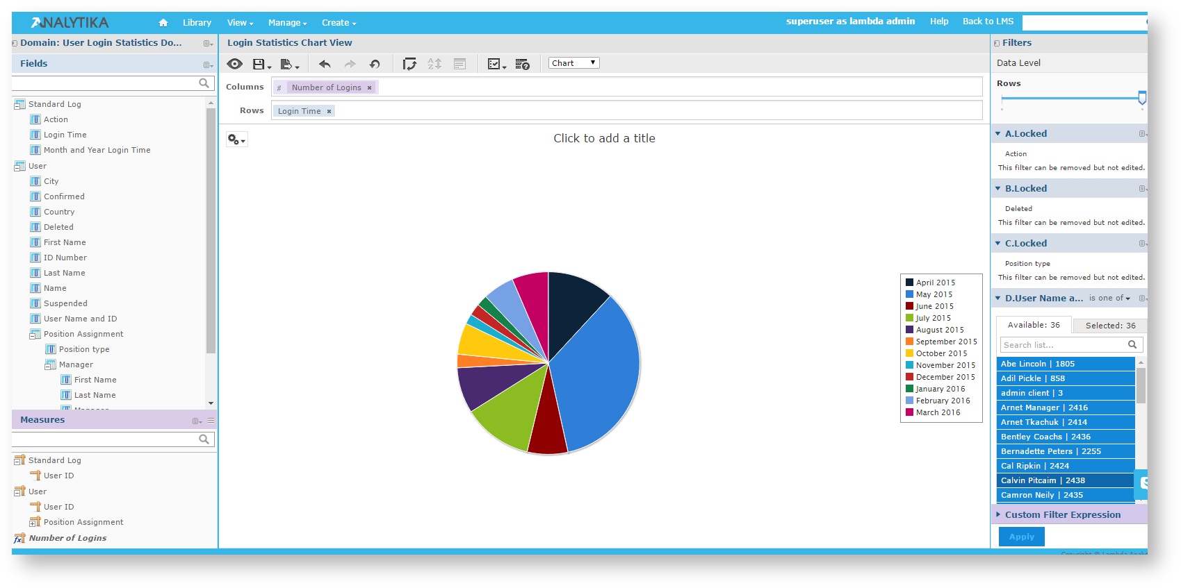 |
| Browser Width significantly greater than Height | 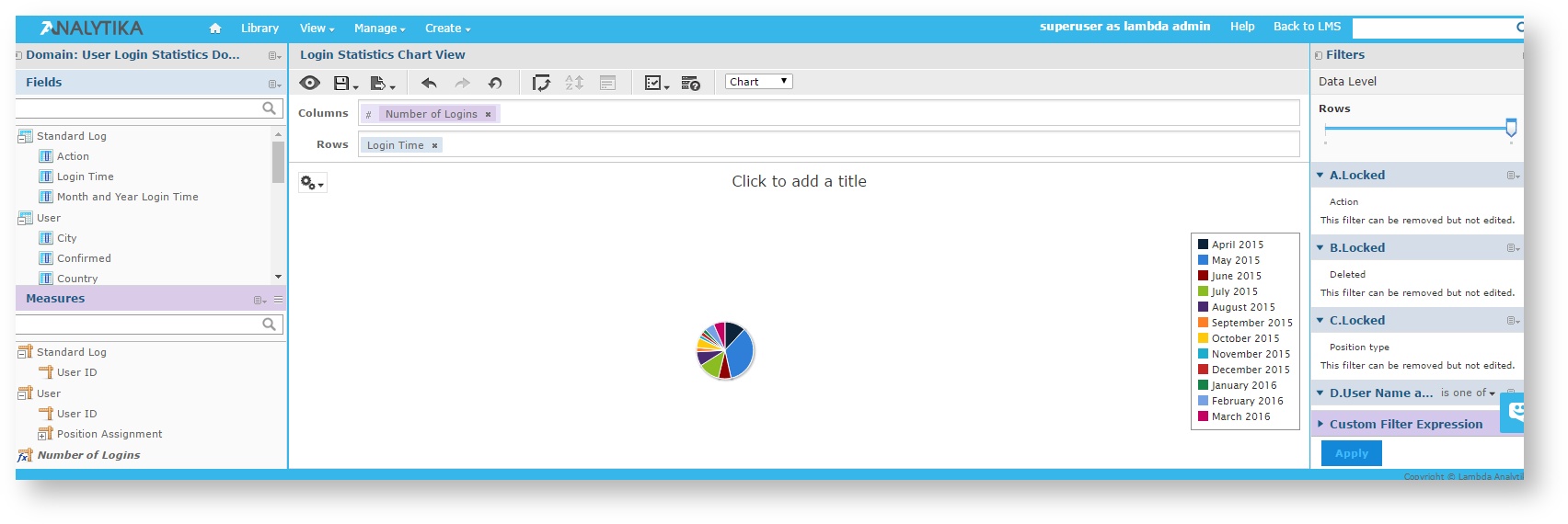 |
For the purposes of this case study, we will use the Login Statistics Chart View, available for both Moodle and Totara data sources. After selecting the view, we will first convert it to a Pie Chart, and then adjust the sizing to fill the available area.
To open the Login Statistics Chart View as a Pie Chart, complete the following steps:
From the Home Page, open the Repository by selecting View > Repository.
In the Folders panel, open the Views folder by selecting Public > Moodle/Totara > Ad Hoc Components > Views.
Click the Login Statistics Chart View to open it in the Ad Hoc Editor.
From the tool bar, click the Pivot icon to orient the field and measure for a Pie Chart.
From the Chart Properties menu, select Chart Types.
Click the Pie Chart icon to convert the Login Statistics Chart View to a Pie Chart:
Close the Select Chart Type window.
To regenerate the Login Statistics Chart View Pie Chart to fill the available space, complete the following steps:
In the Columns box, remove the Number of Logins measure by clicking the X.
From the Measures panel, drag the Number of Logins measure into the Rows box, so that the Login Time field and Number of Logins measure are side by side: This configuration of fields/measures causes the diameter of the Pie Chart to be "full-width."
Once both the Login Time field and the Number of Logins measure are in the Rows box, the Pie Chart will render to fill the available space.